Published
December 10, 2024
Anyone familiar with design also knows that those colorful stamp-size numbered cards with ID numbers are a product of the authority on color, Pantone. Since creating its famous Pantone Matching System in 1963, the color experts have been the go-to for all things pigments, especially in fashion, product design, graphic design, lifestyle, textiles, beauty, interiors, and architectural and industrial design.
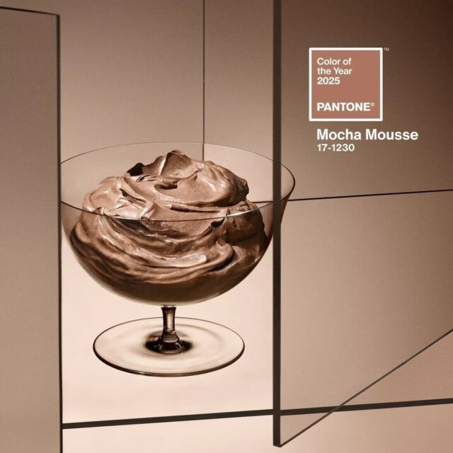
For the last 25 years, they have been naming a color of the year reflecting the cultural zeitgeist. They debuted their 2025 selection, “Mocha Mousse”, in New York with a first-time presence on the London Eye. The color ensconced the massive ferris wheel overlooking the River Thames Southbank.
To celebrate, the brand hosted an event in Manhattan to welcome the tone with this year’s launch partners Motorola, Joybird, Pura, WIx Studio, Libratone, Spoonflower, Ipsy, Society6, Ultrafabrics, Capsule 11, Oyuna and Post-it. FashionNetwork.com caught up with Laurie Pressman, VP of the Pantone Color Institute, following the color’s debut and subsequent reaction to learn how the colors are selected yearly.
Pressman’s global selection team at the Pantone Color Institute consists of 10 to 20 people, depending on the year, and consists of trend analysis, macro-level color trend forecasting, and research. These colors are included in their yearly design products, such as the PantoneView Color Planner, PantoneView home + interiors, and ViewPoint Color trend forecasting guide.

“The selection is a color we across all areas of design that serves as an expression of a mood and an attitude on the part of the consumers and resonates globally,” Pressman said, adding that influence is found through several aspects of popular culture such as the “entertainment industry and films in production, traveling art collections and new artists, fashion, all areas of design, aspirational travel destinations, as well as new lifestyles, playstyles or enjoyable escapes as well as socio-economic conditions and social values.”
Additional influences stem from new technologies, materials, textures, effects, relevant social media platforms, sporting events, and public sentiment.
Given its provenance of determination, Pressman adds that these colors are omnipresent throughout all aspects of design.

“[Mocha Mousse] is a great base color for footwear and an accent shade in fashion accessories – but it’s also suited to digital devices, web design, and any tech-related product in that it brings in a feeling of soft warmth, grounding, and authenticity of nature. For hair and beauty, it sends a message of earthy refinement, quiet chic, and minimalism tied to simplicity. For packaging, a tactile warmth that invites engagement,” she continued, adding, “It’s a great foundational color to mix with other shades. It is a color that is both humble and grounded yet aspirational and luxe.”
While Mocha Mousse may evoke a cozy vibe and warm brown shades, it can also evoke some of our most delicious foods, such as coffee with cream and chocolate, which not all netizens took to at its debut. Industry critic Instagram account Diet Prada noted some of its more choice reactions to the color.
While the snappy feed called out one social media commentator who felt the color reflected ‘comfort and sophistication,’ other reactions ranged from suggestion Mousse meant Mouse; it was the color of watercolor brush cleaning water; and some felt it wasn’t fresh thanks to the Kardashian-inspired makeup color trends.

In contrast, others likened it to the possible shitstorm that 2025 is predicted to be due to a dramatically different administration and shifting cultural tides. One poster wondered if it was political concerning the Trad Wife, neutral beige houses, and clean girl movement. Another noted that its grey tones might be prep for an oncoming emotional depression.
For her part, Pressman takes it all in stride, reminding readers of the Pantone Color of the Year’s role.
“There will always be naysayers and a reminder that the Pantone Color of the Year is not a prediction, but instead a color that we see crossing all areas of design, a color that serves as an expression of a mood and an attitude on the part of the consumers, a color that reflects what people are looking for, what they feel they need that color can hope to answer. To sum it up, a color that captures the global cultural zeitgeist and is expressed through the silent language of color,” she concluded.
Copyright © 2024 FashionNetwork.com All rights reserved.


